Image
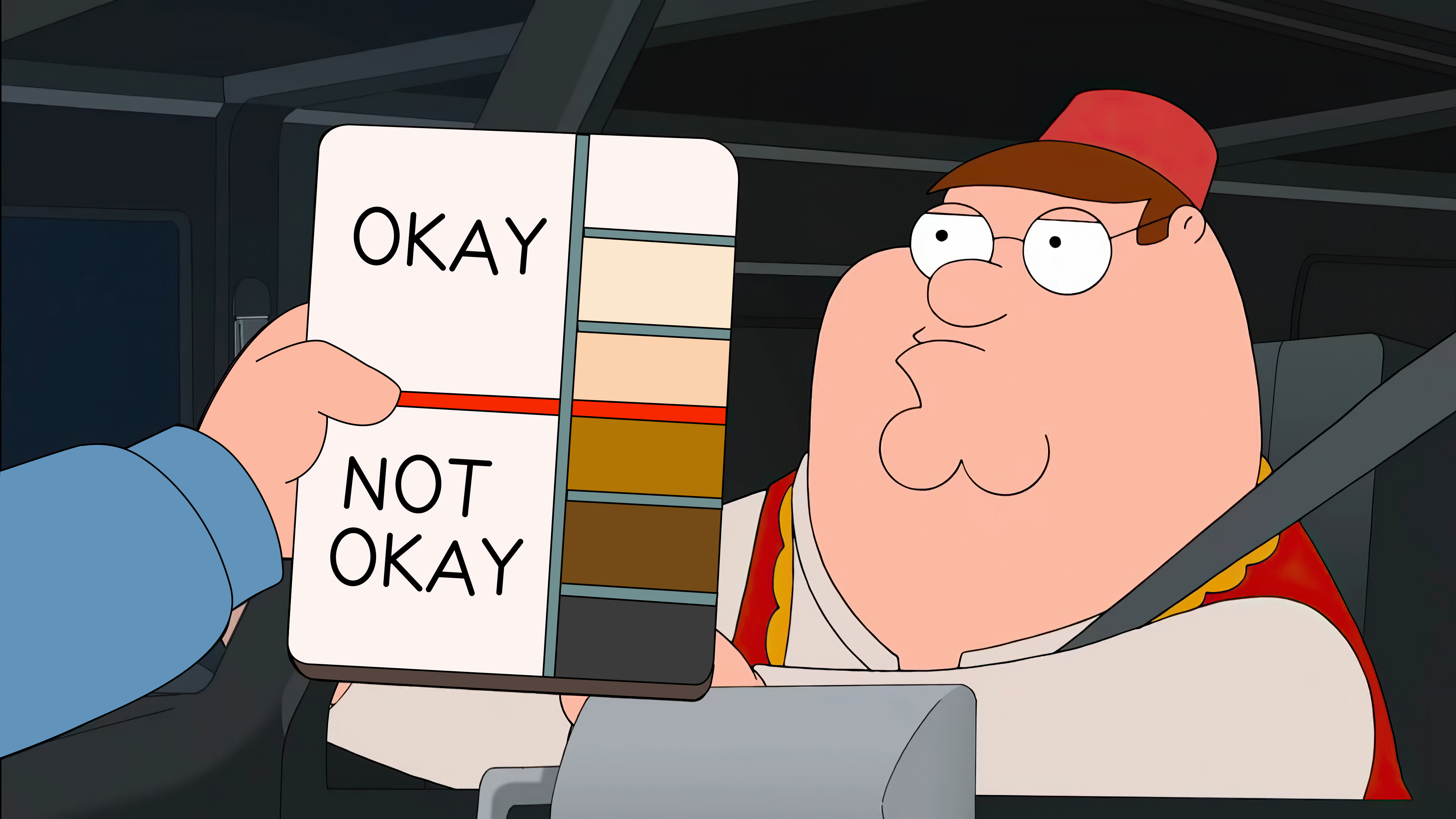
Peter Griffin Skin Tone Chart Meme Template
About this meme
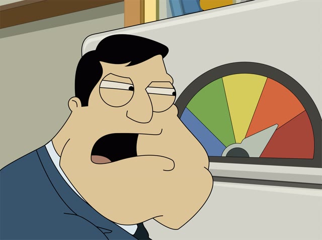
This high-definition frame is from the animated series Family Guy, specifically the Season 10 episode "Tea Peter." In the scene, an immigration officer (voiced by Seth MacFarlane) holds up a color-coded skin tone chart to Peter Griffin to determine who is "Okay" and who is "Not Okay." In meme culture, it is the definitive visual for arbitrary gatekeeping, satirizing racial profiling, hypocritical standards, or
- The Chart (The Filter): Held up as an absolute standard representing The Gatekeeper, The Algorithm, , or The AI Model.
- Peter Griffin (The Subject): Wearing a fez and sitting in a car representing The Individual, The Script Under Review, The Content Creator, or The 205th Milestone.
- The "Okay" vs "Not Okay" Labels: Representing The Double Standard, The Viral Potential, , or The Goal.
- The Fez: Representing The Cultural Context, The Costume, The Punjab Heritage, or The Workspace.
Images (1)
Categories & Tags
Tags
Personalities / Characters
Emotions
Countries / Regions
United States
Languages
English
Additional Info
Available as image
Resolution 3840 x 2160
Orientation Landscape
File size 6.9 MB
Created April 8, 2026
Last updated September 21, 2026